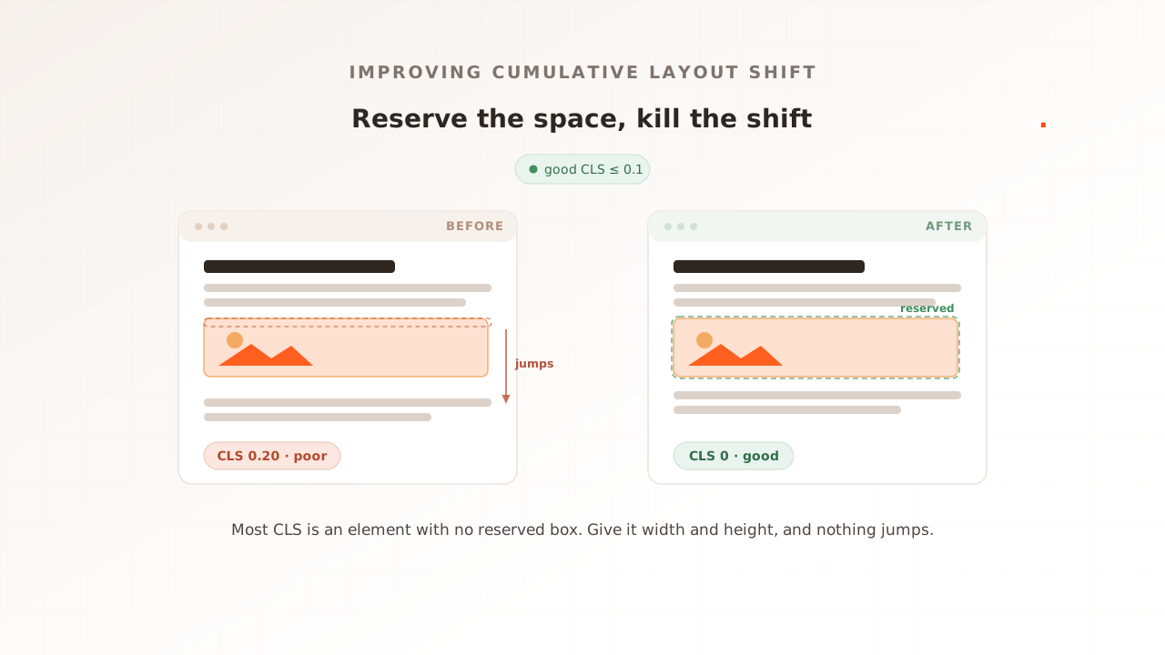
To improve Cumulative Layout Shift, find what moves on the page and reserve its space before it loads. Almost every layout shift is the same bug: an element arrives without a box held for it, so everything below it jumps. Reserve that box, and the shift disappears. As of the 2025 Web Almanac, 81% of mobile pages already have a good CLS, the best pass rate of the three Core Web Vitals, yet roughly one in five still fail it, and 62% of mobile pages still ship at least one image without dimensions (2025 Web Almanac).
That last number is the whole story. CLS is the easiest Vital to fix, because the cure is almost always the same move applied in a few places. This guide is the practical playbook: the fixes in priority order, the code for each, the font trick most teams skip, and how to confirm the number held for real users. There is no separate explainer to send you to for the concept, so the first section covers what CLS is and how it is scored before the fixes begin.
First, find what shifts, and how CLS is scored
CLS measures how much visible content moves unexpectedly while a page loads. It is unitless: each shift is scored as the impact fraction times the distance fraction, the share of the viewport that moved multiplied by how far it travelled. Your CLS is not the sum of every shift but the largest burst of shifts in a session window, a group of shifts less than a second apart, capped at five seconds (web.dev). Google rates 0.1 or less as good and above 0.25 as poor, at the 75th percentile of real loads.
Before you fix anything, see what is moving. The Chrome DevTools Performance panel records each layout shift and names the element that jumped; a free page speed test with Evaluat Pulse, or a Lighthouse audit, lists the largest shifts under “Avoid large layout shifts” with the culprit nodes. Fix what the tool points at, not what you assume.
Nearly all of it traces to five causes, and they set the order of the fixes below: images without dimensions, ads and embeds without reserved space, dynamically injected content, web fonts that reflow on swap, and animations that move layout instead of pixels.
| Fix, in order | The cause it removes | The change | Effort vs payoff |
|---|---|---|---|
| Size every image and video | Unsized media | width/height or aspect-ratio | Low effort, usually the biggest win |
| Reserve space for ads, embeds, iframes | Late third-party content | min-height or aspect-ratio container | Low-medium, large on ad-heavy pages |
| Reserve or overlay injected content | Banners and notices pushing content down | Placeholder space, or overlay instead of insert | Medium |
| Match the fallback to the web font | Font-swap reflow | font-display plus metric overrides | Medium, subtle but real |
| Animate with transform | Layout-triggering animation | transform instead of top/height | Low |
Step 1: give every image and video explicit dimensions
This is the highest-leverage fix, and the one most sites still miss. When an image has no declared size, the browser does not know how tall it will be, so it lays out the page as if the image were zero height and then shoves everything down when the file arrives. Declaring the size lets the browser reserve the exact box up front.
Set width and height attributes on every <img> and <video>. Modern browsers turn those two numbers into an aspect ratio and reserve the right space even when CSS scales the image to a different width:
<img src="/photo.avif" width="1280" height="720" alt="A clear description" />For responsive images sized in CSS, keep the attributes and let height: auto scale them, or reserve the box directly with the aspect-ratio property:
.hero img {
  width: 100%;
  height: auto;     /* preserves the reserved aspect ratio from width/height */
  aspect-ratio: 16 / 9;
}
The room to improve here is large: 62% of mobile pages fail to set dimensions on at least one image, down from 66% in 2024 (2025 Web Almanac). On a framework you mostly get this for free, since next/image and Astro’s <Image> require dimensions and emit them for you. Verify it worked by reloading with the DevTools Performance panel recording: the image should appear with no shift logged against it.
Step 2: reserve space for ads, embeds, and iframes
Third-party content is the next cause, and it is worse than images because it loads later and you do not control its timing. An ad slot, a YouTube embed, or a social card that fills in after the text has painted will push everything below it down unless you have reserved the space.
Reserve the slot’s known dimensions before the third party arrives. For an ad unit with a fixed size, set a min-height on its container; for an embed with a known shape, use aspect-ratio:
.ad-slot      { min-height: 280px; }   /* hold the slot's height up front */
.video-embed  { aspect-ratio: 16 / 9; } /* hold an iframe's shape */
When the size is genuinely unknown, two tactics help. Place the late-loading content below the fold where a shift is less likely to land inside a session window, and never reserve too little, because a slot that grows past its min-height still shifts. If an ad can return one of several heights, reserve the most common one and accept the occasional small move rather than reserving nothing.
Step 3: stop injected content from pushing the page
Content your own code adds after load is the third cause: cookie banners, consent bars, “subscribe” prompts, promotional ribbons, and “you may also like” blocks. Each one inserted above existing content pushes that content down and scores a shift.
There are two clean fixes. Reserve the space in advance with a placeholder or skeleton the same size as the incoming content, so the real thing drops into a held box. Or overlay the element instead of inserting it, positioning a banner over the page with position: fixed or absolute so it covers content rather than displacing it. One important exception built into the metric: a shift within 500 milliseconds of a user interaction is excluded from CLS, so content that appears because someone tapped a button (an expanding menu, a “load more” click) does not count. Use that. If a banner must push the layout, trigger it from an interaction, not automatically on load.
Step 4: eliminate font-swap shifts
Web fonts cause a subtler shift. The browser paints text in a fallback font first, then swaps to your web font when it loads, and if the two fonts have different metrics the text reflows and moves the content around it. This is the cause teams notice last, because each shift is small, but on a text-heavy page they add up.
The fix is to make the fallback take the same space as the web font. Set font-display: optional so the browser does not swap mid-view, preload the critical font so it is more likely to arrive before first paint, and use the @font-face metric override descriptors to size a fallback to match (web.dev, 2025):
@font-face {
  font-family: 'Brand';
  src: url('/brand.woff2') format('woff2');
  font-display: optional;
}
@font-face {
  font-family: 'Brand-fallback';
  src: local('Arial');
  size-adjust: 107%;       /* scale the fallback to the web font's width */
  ascent-override: 90%;
  descent-override: 22%;
  line-gap-override: 0%;
}
With the fallback tuned to the same line height and width, the swap becomes invisible and the reflow disappears.
Step 5: animate with transform, not layout
The last cause is animation. Transitioning a property that affects layout, such as top, left, height, width, or margin, moves every neighbouring element on each frame and can register as shift. Animating transform (translate, scale, rotate) does not, because the browser composites the change without re-running layout:
.panel { transition: transform 0.2s ease; }  /* good: no layout, no shift */
/* avoid: .panel { transition: top 0.2s ease; }  moves neighbours each frame */
One free win sits alongside this: the back/forward cache. When a visitor navigates back, a bfcache-eligible page is restored exactly as they left it, fully laid out, so there is no reload and no fresh shift (web.dev, 2025). Keeping pages bfcache-eligible (avoid unload listeners) protects CLS on every back navigation for free.
Verify the fix held: real users, at the 75th percentile
A layout shift you fixed in the lab is not a layout shift fixed in the field. Confirm the change with real-user data, at the 75th percentile, because a single fast load on a fast machine hides the shifts that slow networks and late third parties produce.
Read field CLS with Google’s web-vitals library, which reports the value the browser actually recorded:
import { onCLS } from 'web-vitals';

onCLS(({ value, rating }) => {
  console.log(value, rating); // e.g. 0.04, "good"
});
The attribution build also names the largest shifting element, so a regression points straight at the component that caused it. CLS is the least load-sensitive Vital, since shifts are structural rather than server-bound, so it usually holds steady under concurrency while Largest Contentful Paint and Interaction to Next Paint degrade. But still measure it on real devices and networks, because a font, image, or ad that arrives late on a slow connection shifts more than it does on your desk. Core Web Vitals: lab vs field covers why the two numbers differ, and performance regression testing shows how to gate CLS in CI so a fixed shift does not quietly return.
The payoff is well documented. Yahoo! JAPAN News cut CLS from roughly 0.2 to 0 with aspect-ratio boxes and saw page views per session rise 15%, sessions run 13% longer, and bounce rate fall 1.72 points (web.dev, 2021). Smaller gains pay too: iCook improved CLS by 15% and earned 10% more ad revenue (web.dev, 2021).
Common mistakes when improving CLS
The same errors leave CLS stuck after a first pass. Each has a direct fix.
- Sizing some images but not all. One unsized hero or thumbnail is enough to fail. Audit every
<img>, not just the obvious ones. - Forgetting ads and iframes. Images get sized while the ad slot that loads two seconds later is ignored. Reserve every third-party box.
- Injecting a cookie or consent banner above content. The most common avoidable shift on the web. Reserve its space or overlay it; never push the page on load.
- Lazy-loading without reserving space. Lazy loading is good for performance and bad for CLS if the box is not held. Keep the dimensions on lazy images.
- Setting
aspect-ratiothen overriding it. A laterheightrule can cancel the reserved box. Confirm the computed size in DevTools, do not assume the CSS won. - Judging CLS on desktop, or on one fast load. Mobile shifts more, because fonts, images, and ads arrive later on slower networks. Test mobile, at the 75th percentile.
Where Evaluat fits
Be honest about the tool you need here. CLS is the one Core Web Vital you can usually fix without a load test, because shifts are structural. A single real-browser audit catches most of them: Evaluat Pulse loads your page once in a real browser and returns CLS alongside LCP, FCP, and TTFB with Evaluat’s composite grade and a video. A cold load does not produce a representative INP. For debugging CLS on one page, that controlled reading is often enough.
Evaluat earns its place on the other two Vitals and the cases where CLS does depend on load. It runs each virtual user in an isolated real browser and captures CLS alongside Largest Contentful Paint and Interaction to Next Paint, per session, under concurrency, so you see CLS in the same run as the metrics that genuinely degrade under traffic, and you catch the layout shift that only appears when a third-party tag or ad fills in differently at peak. How it works covers the architecture, and how to improve LCP is the companion playbook for the Vital that moves most under load.
Improving CLS comes down to one habit: reserve the space before the content arrives. Size your media, hold your ad and embed slots, keep injected content from pushing the page, tune your fonts, and animate with transform. Then confirm it in the field, at the 75th percentile, where your users actually load the page.
Test in real browsers. Debug in real sessions. Book a demo.